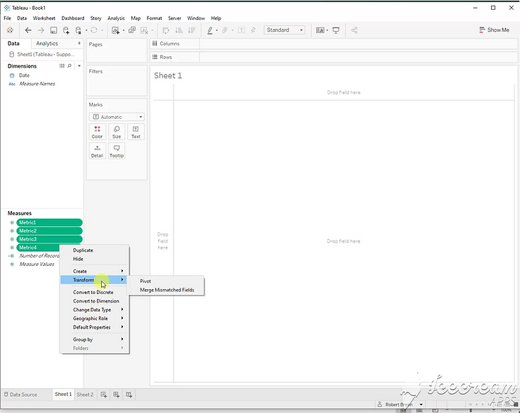
![](https://ynteractive.com/wp-content/uploads/2023/02/c8bad1_bcc27d82c9fc4360807d8ea9b508adfemv2.png)
Step 1:
Select all of your metrics. Right click one of them. Select Transform > Pivot. This will give you pivot field names and pivot field values.
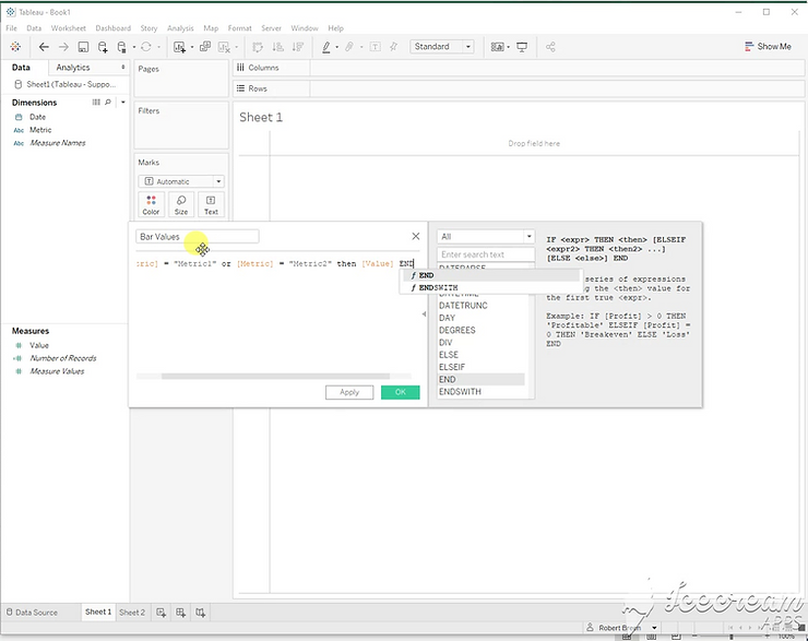
![](https://ynteractive.com/wp-content/uploads/2023/02/c8bad1_4ede44f2f5ae4c63ab6b039417100680mv2.png)
Step 2:
Create this calculated field for your bar values.
If [Metric] = “Metric1” or [Metric] = “Metric2” then [Value] end
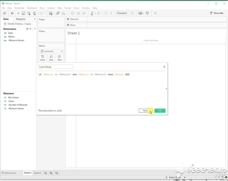
![](https://ynteractive.com/wp-content/uploads/2023/02/c8bad1_50fbf275c2e4470fa202dcdfcbb5eacbmv2.png)
Step 3:
Create this calculated field for your line values.
If [Metric] <> “Metric1” and [Metric] <> “Metric2” then [Value] end
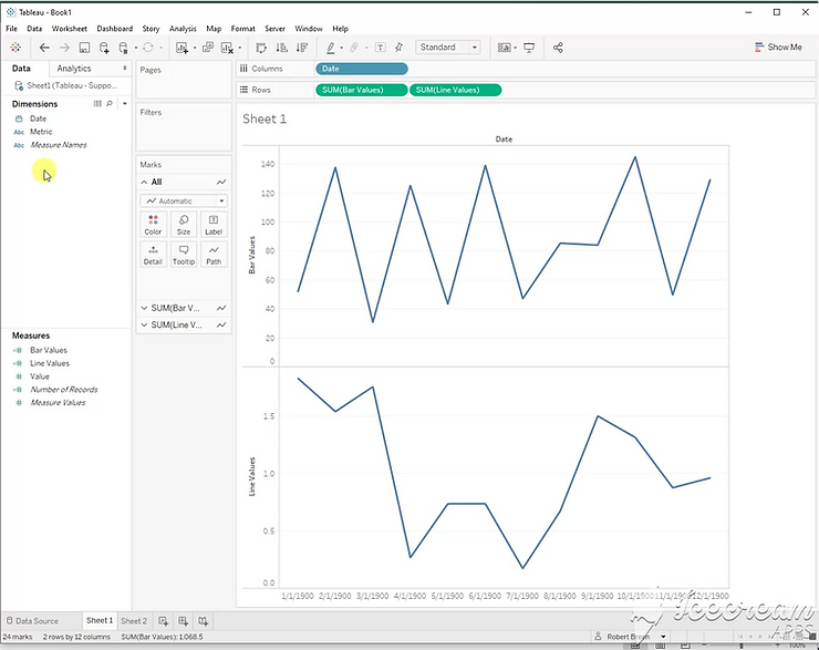
![](https://ynteractive.com/wp-content/uploads/2023/02/c8bad1_343a40da6c8647649d1205836bc673ddmv2.png)
Step 4:
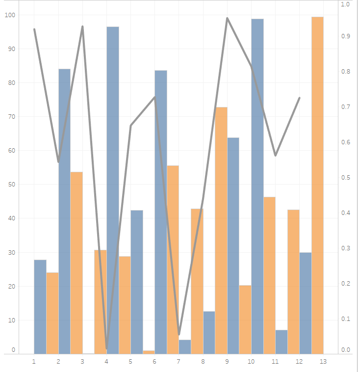
Create a dual axis chart with [Bar values], [Line Values], and [Date].
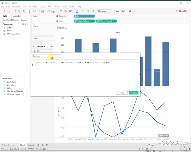
![](https://ynteractive.com/wp-content/uploads/2023/02/c8bad1_2d62e0ed884841f88e342e7b82afcdd0mv2.png)
Step 5:
To separate the stacked bar chart, use this calculation on the columns shelf.
If [Metric] = “Metric2” then month([Date])+.5 else month([Date]) end
![](https://ynteractive.com/wp-content/uploads/2023/02/c8bad1_c413ad63c5924f178a33c95b4e7d70a7mv2.png)
Step 6:
Add color and set as dual axis.
![](https://ynteractive.com/wp-content/uploads/2023/02/c8bad1_c5d1abf2604640f68ea9c783cdfcec46mv2.png)