0:00
/ 1:54
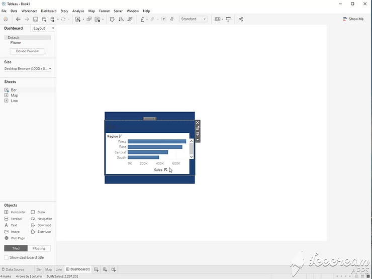
Step 1:
Start with three sheets. A Bar Chart, Line Chart, and a Map View.
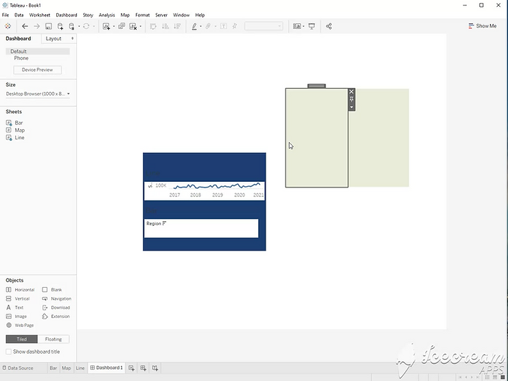
Step 2:
Set your objects to Floating. Drag in a vertical container.
Step 3:
Add any color to the container so it is easier to see. Drag two blank boxes into the container. This will make it easier to add more objects later.

Step 4:
Drag the bar chart and line chart into the container. If you are still using floating objects, you can either hold the control key down, or change it to tiled.
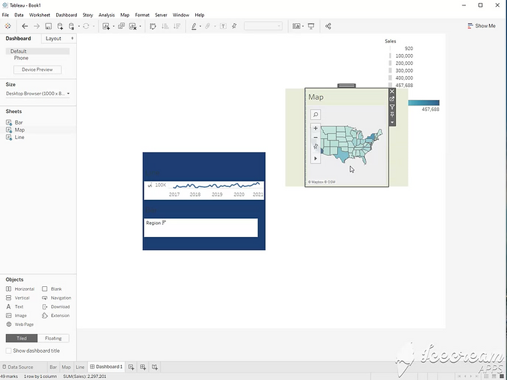
Step 5:
Add a second floating container to the view. Color it as well, and drag in two blank boxes.
Step 6:
Drag your map view into the new container.
Step 7:
Double click the handle on your bar chart to select the first container. Hold the control key down, and drag it into the second container.
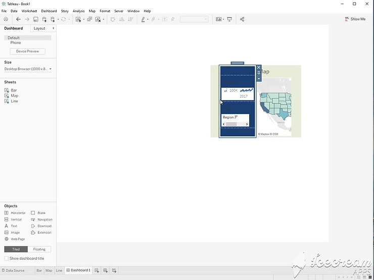
Step 8:
Double click the container’s handle to select the second container. Hold the control key down, and tile the container into the dashboard.
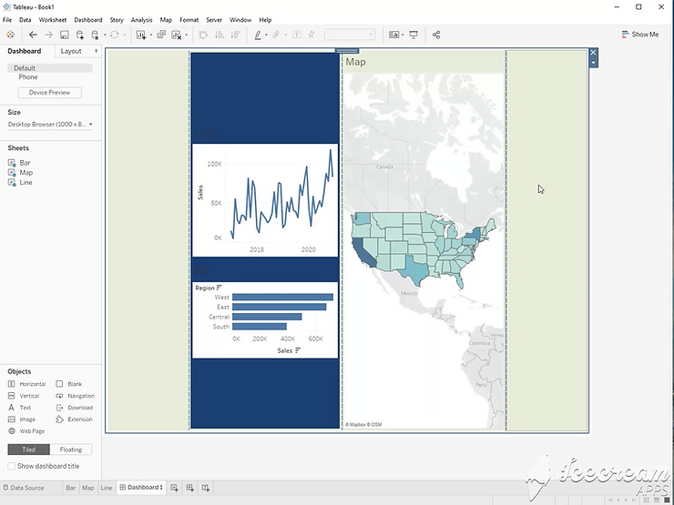
Step 9:
Now, you can delete the blank boxes, remove the colors, and distribute evenly for a clean dashboard layout.