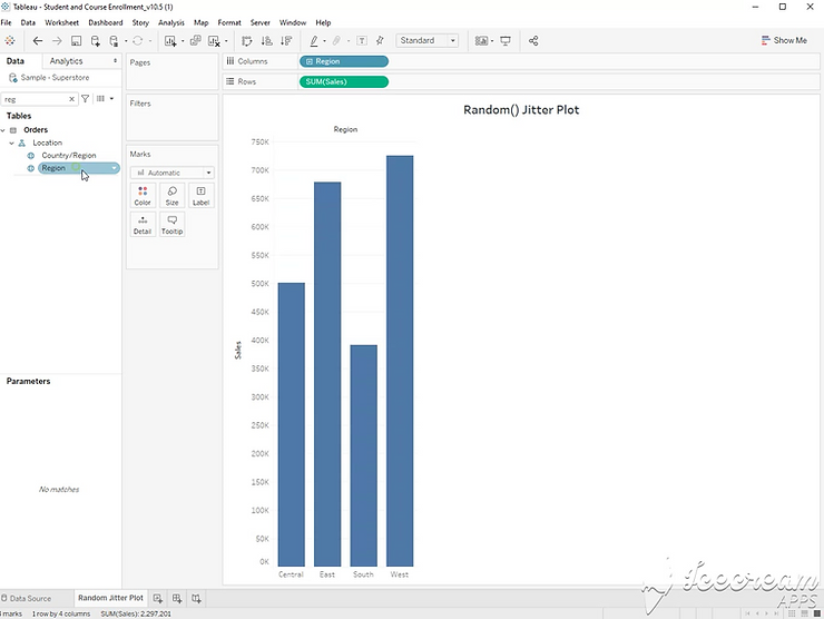
Step 1:
Drag [Sales] to the rows shelf, and [Region] to the columns shelf.
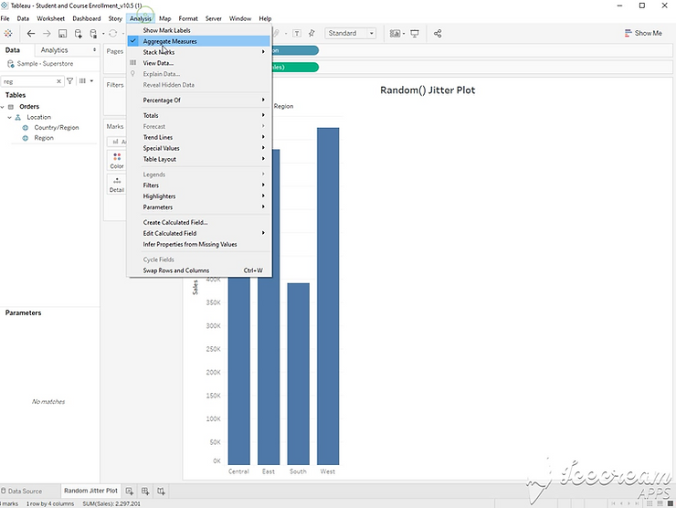
Step 2:
Click Analysis, and unselect “Aggregate Measures”. This will result in a box plot with a single mark for each row in your data.
Step 3:
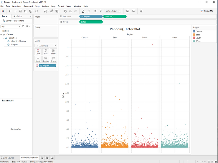
You can now adjust the color and size of each mark, but it’s still difficult to see each individual circle. Here’s where the jitter plot comes in.
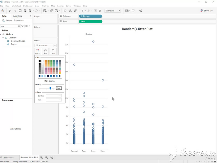
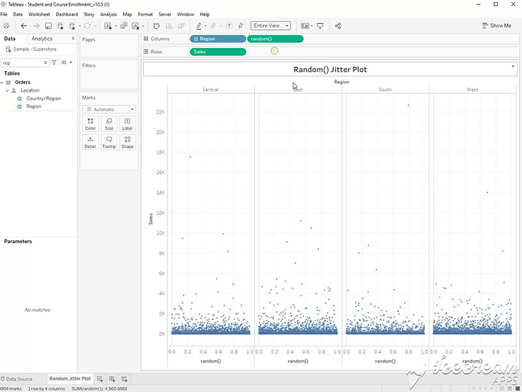
Step 4:
Double click the columns shelf, and type RANDOM(). This will give each mark a random value to be used as the x axis. Now, each mark can be hovered over to click. Movement left or right along the x axis are random, but movement up and down along the y axis still tell us the sales amount.